
South James
Talent & Production
Discipline UI/ UX, Graphic Design
Duration 4 Weeks
JOB OVERVIEW
The South James Agency is a Talent Agency & Production Company. Initially they were in need of a site redesign for their talent site, but as the job continued we realized the production site needed reworking as well. Since the Website redesigns, I have been building promotional assets for them, including e-blasts, & social media content.
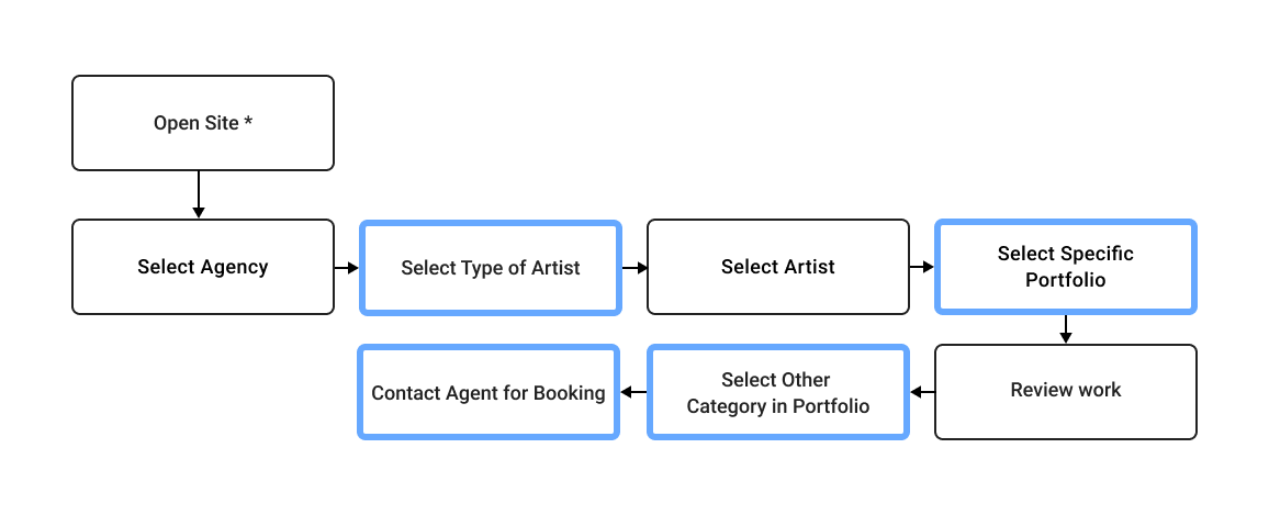
To skip directly to a specific part of the job, use the jump link buttons here.
AGENCY OVERVIEW
The South James Agency is a talent agency reprenting artists from Photographers & Directors to Hair & Makeup. They were in need of a total UI/UX rework, to help prospective clients find talent and their specific work as quickly as possible.
Speed
Simplicity
Clarity
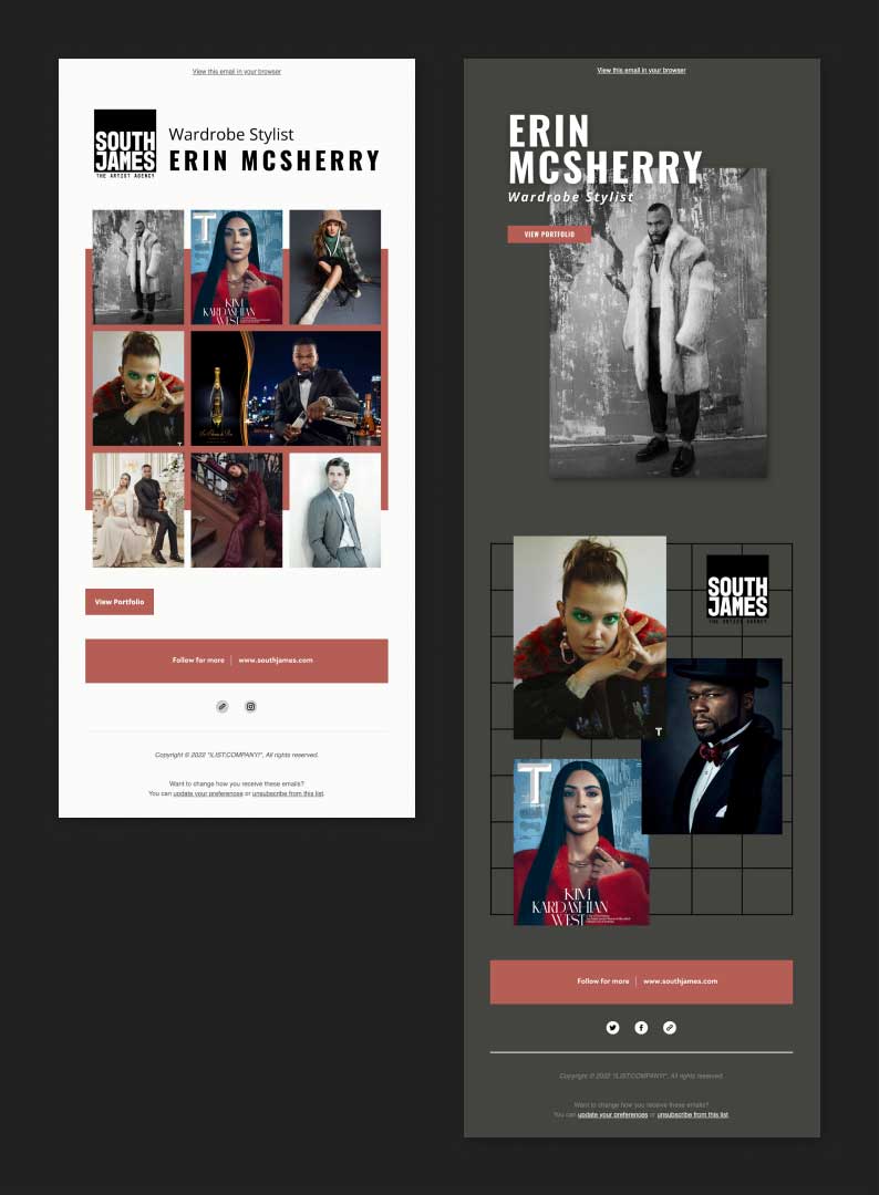
INTRODUCING THE BRAND
HELLO WE'RE SOUTH JAMES!
As with any other site you need to start with the landing page. We decided that it should be as clean as possible, with simple site navigation to the left (for ease of reading), paired with a looping gif to showcase some selected artists and their work, with each image giving credit to its respective artist.
FULL ROSTER
QUICK RESULTS
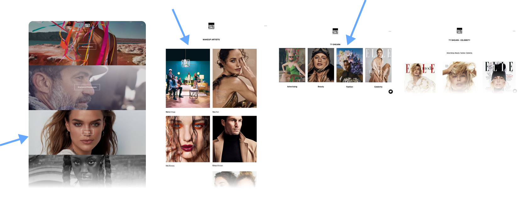
Potential clients would then select artists from a subsequent page with a full list of every artist by category. As you hover over each person's name you get a 3-image gif preview of their work. This solution limits scrolling endlessly to find what you're looking for, which can cause user frustration.
FULL ROSTER
SECONDARY NAVIGATION
In addition to the mega-list of talent, there are also drop-down sections for each division visible on the top navigation of the site. This was integrated so a client viewing one artist's page can quickly access information about another artist without returning to the mega-list.
ARTIST PAGE
SORTING WORK & LABELING
All of an artist's work is visible when you land on their page. You can then sort through their work by category to see what you are looking for even faster.
The artist's specialty is displayed directly under their name, along with contact information for their agent. My research showed that this was one of the most frustrating elements in competitors' sites.
USER RESEARCH
COMPETITIVE ANALYSIS
The existing South James website was difficult to use; there were many instances where “clicks” could be eliminated or reduced to streamline the user experience and minimize any potential frustration.
To see the full Audit and research, click the button below:
GUIDING PRINCIPLES:
• Always Indicate type of artist
• Create multiple ways to view artist roster, including full list
• Make it easy to contact specific agents
• Reduce number of clicks to access artists
• Simplify navigation
PRODUCTION OVERVIEW
In addition to the Agency Page, South James Productions also needed working. In this case we wanted to show off all the great brands they work with and the variety of work that is being created, while also giving the user multiple ways to discover all of this content on the landing page and throughtout the site.
Showcase
Discoverability
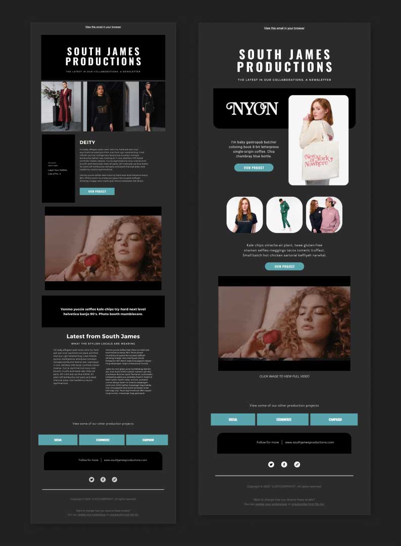
LAUNCHING POINT
THE OPTIMAL LANDING PAGE
To start off, the top the landing page mimics the Agency page almost exactly, except this one is in "night mode". Even the accent color is simply an inversion of the burgundy of the other site.
This is then paired with the demo reel of the prodiuction company showcasing all of their work.
PREVIEW TYPES OF WORK
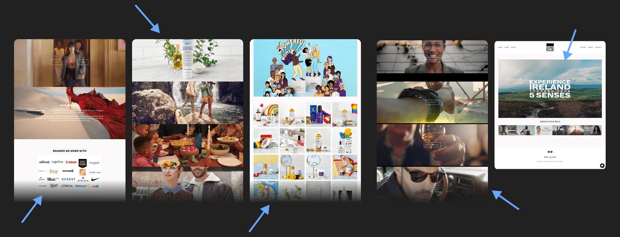
The production company focuses on three principal types of work: Social, Ecommerce, & Campaigns. These categories continue to drive the site: scrolling down opens a tabbed interaction that allows for six projects to be previewed and explored.
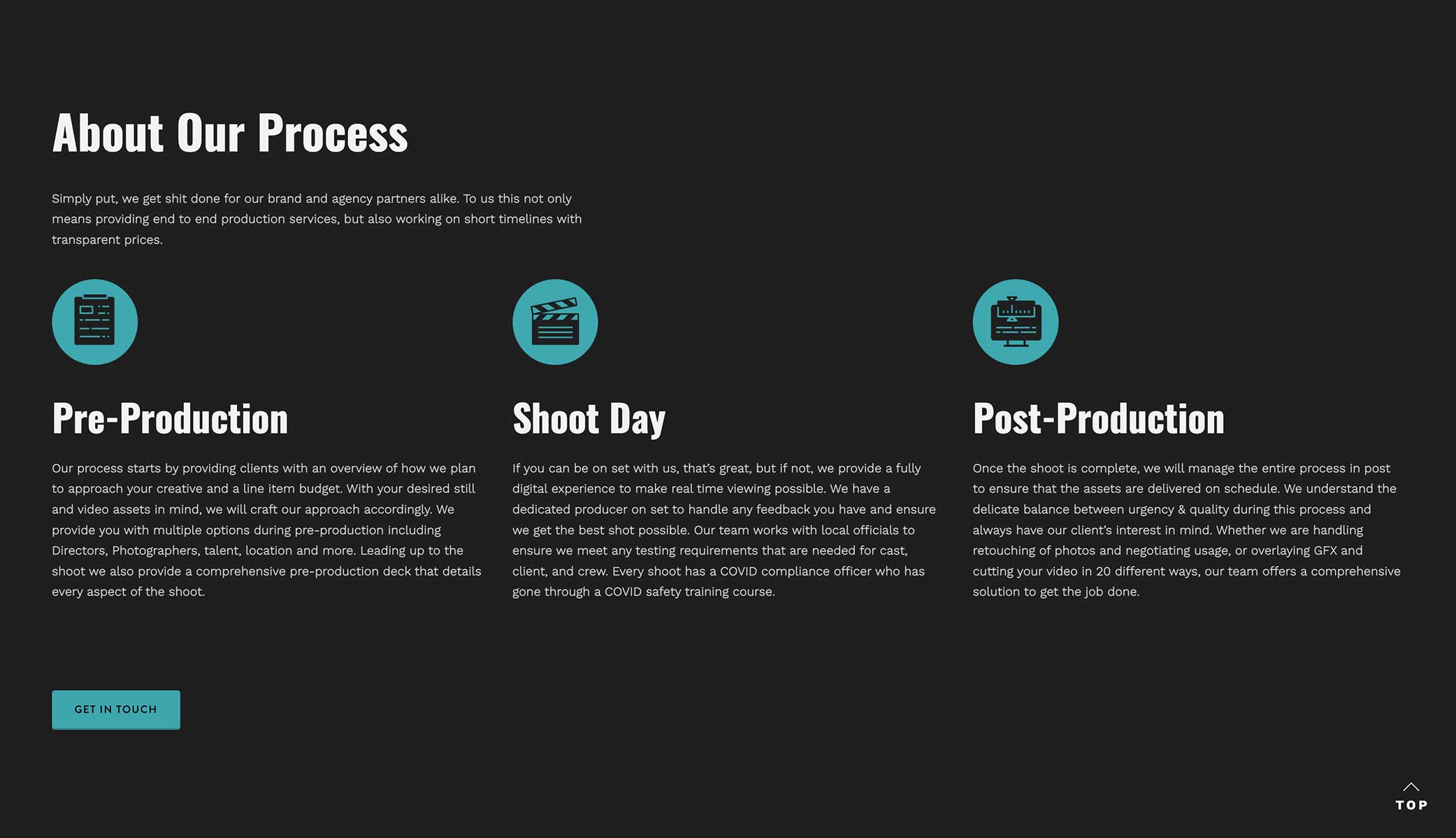
PROCESS WALKTHROUGH
The next section explains South James' process in-depth and is broken down into: Pre-Production, Shoot Day, & Post-Production. Each stage of the process is paired with an icon.
This is then followed by a CTA button to contact the production company.
CLIENT LOGO GRID
Virtually every website has one of these features; however they rarely serve any actual purpose other than to visually list their clients.
In this case we took the opportunity to make it an interactive element. When the user hovers over each logo they get an image preview of the sort of work that was created for that brand. When the logo is clicked the user is directed to all the work done for that brand.
This was an excellent opportunity to allow the user to browse content not only by type (social, ecommerce, campaign) but also by theme or brand of work (lifestyle, beauty, etc.)
NAVIGATION
OVERVIEW PAGES
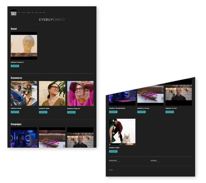
The core of the site is then built to show off each category of work. Each section has an overview page with a simple two-column linear display of projects hand selected to be displayed for the client to consider.
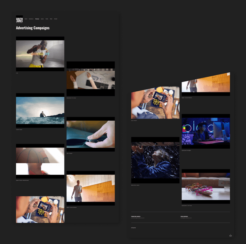
PROJECT PAGES
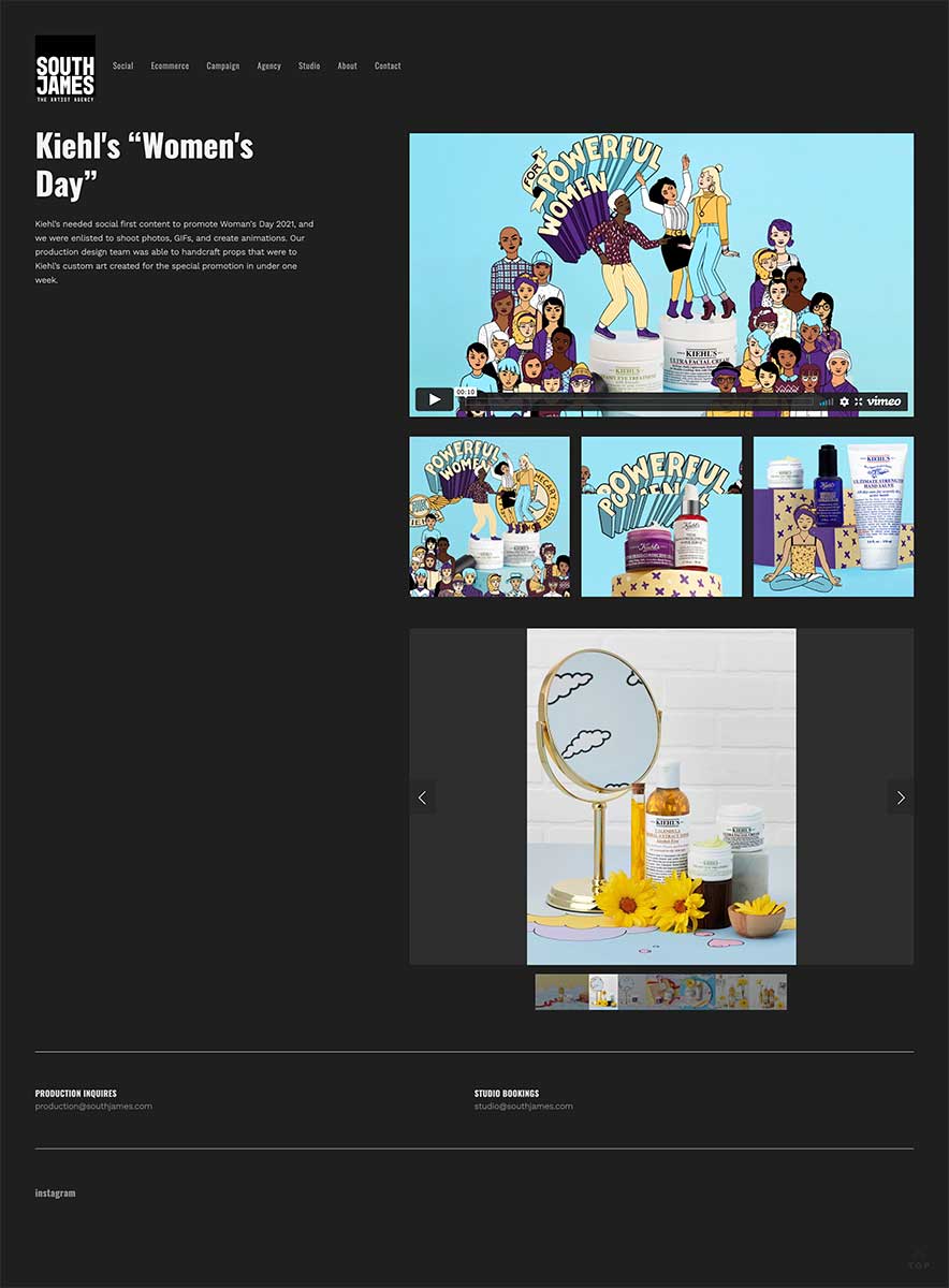
ASSETS
Lastly the user gets a description of the job along with a showcase of the assets created for that client.
USER RESEARCH
COMPETITIVE ANALYSIS
The initial page of the existing production site required the user to choose between photo or video work. This made things confusing from the start, since many jobs included both kinds of work, but a viewer was then sent off in one direction or the other, losing sight of the whole project.
By creating a landing page with different navigational elements, the user now gets a complete sense of the services that were provided and is able to explore under their own power.
To see the full Audit and research, click the button below:
• Keep it simple with a one pager
• Showcase: Services, clients, contact info, overview of work, type / range of work
• Footer on the site
• Pair a CTA button with mission statement
VISUAL DESIGN
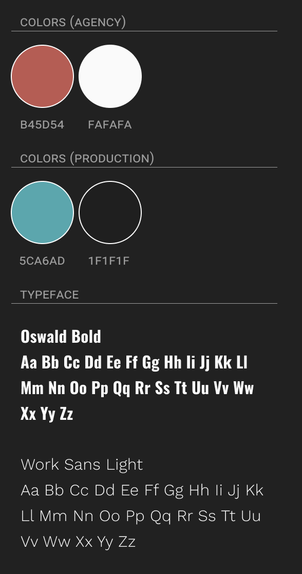
STYLE GUIDE
The accent color for the agency was a dusty burgundy / rose. This could be interpreted as a shade of lipstick or a more masculine metaphor. It's also light enough not to compete with the black text and is accessible for readability.
For the production site the color scheme was the "night mode" of the agency site, even the accent color is simply an inversion of the burgundy of the other site.
PROMOTIONAL ASSETS
In addition to reworking & designing the new agency & production site, South James also commissioned me to build a set of e-blast layouts to promote new jobs as they come in. I created a system that has interchangeable elements so they can keep the content looking fresh while they update their client list.
E-Blast
Social Content (coming soon)
Thank You!
Thank you for taking the time to look through my work with The South James Agency.
Web Development by Will Truran
Emma Canfield | Email