Discipline FUI, Animation, Interaction Design
Duration 5 weeks
Introduction
There is a large fashion / beauty community on Youtube. Many of these videos are makeup tutorials and “get ready with me" videos. I designed this interface to be integrated with a mirror so the user could interact with it in the morning as part of their daily routine, follow along with a “beauty guru” from a youtube tutorial, and access an interactive user guide connected with the video to help step-by-step.
Greeting
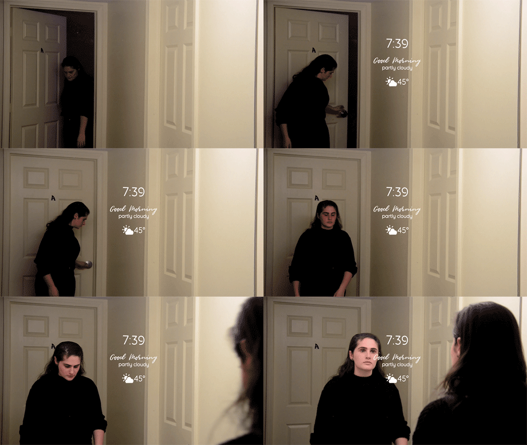
Upon approaching the mirror it lights up to greet the user, displays the time & weather forecast, which move to the corner but remain active during the rest of the session.
The user can access more detailed information by tapping.
View Schedule
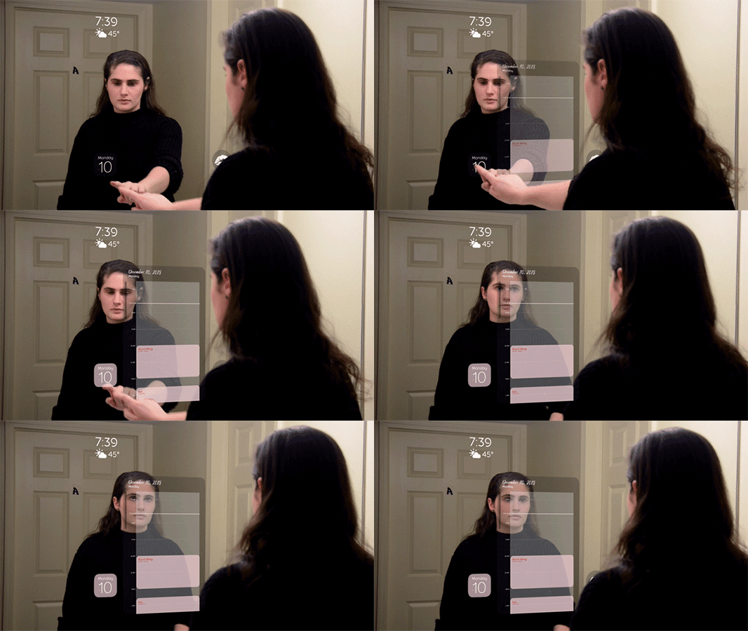
The user can then check their schedule for the day to
see what sort of look they need to be getting ready for, and choose between a variety of options.
Browse by Category
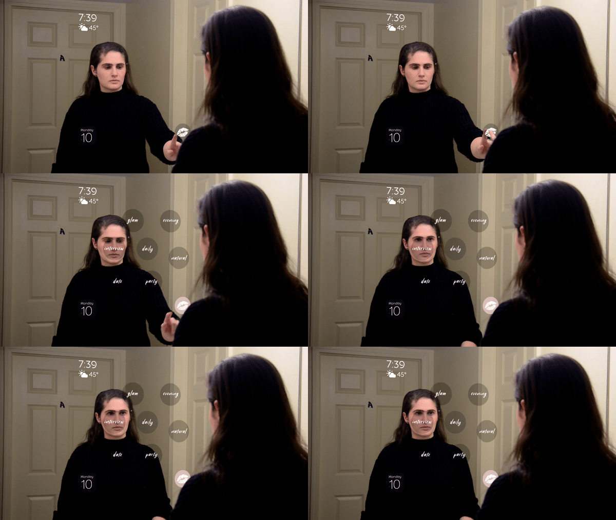
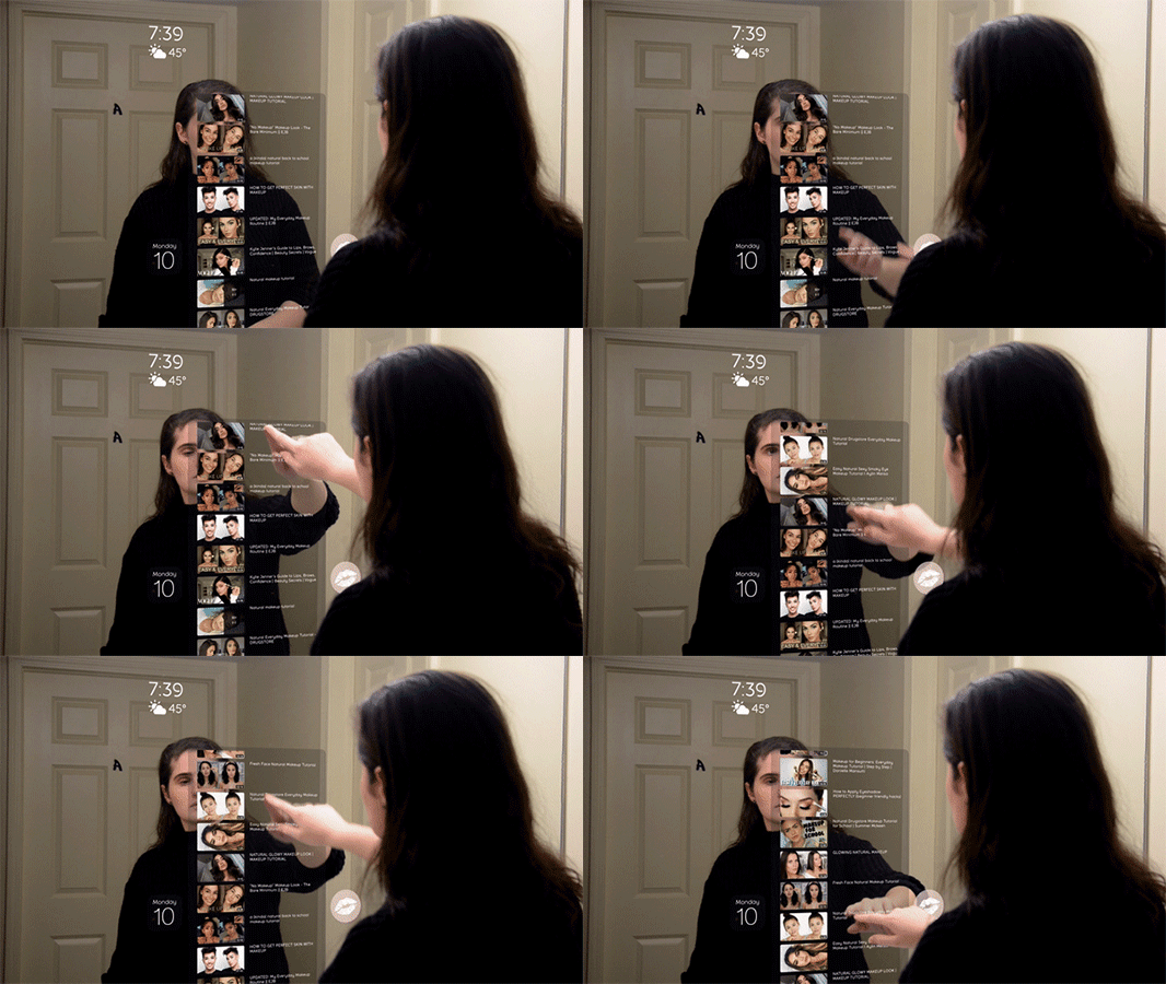
The user can then pull up a youtube tutorial panel of saved looks, and browse for appropriate videos to follow along with for their planned day’s activity (ex: job interview,
night out, daily, natural, glam, party, etc.).
Select Tutorial
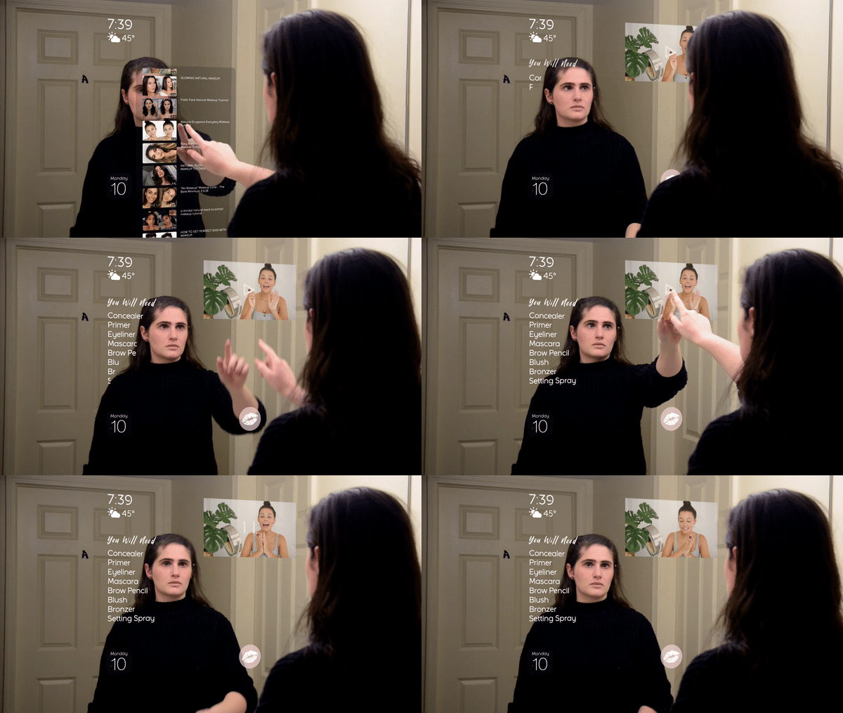
Once a makeup Style is selected a scrolling list of videos appears for the user to make their selection, which they can edit based on materials on hand or the amount of time availble to get ready.
Itemized Products
As a video loads and plays through the ads, it tells the user what tools and products they need for the tutorial. Users can scan and store a list of what they have, and the interface will suggest the best alternatives for any missing items.
Face Mapping
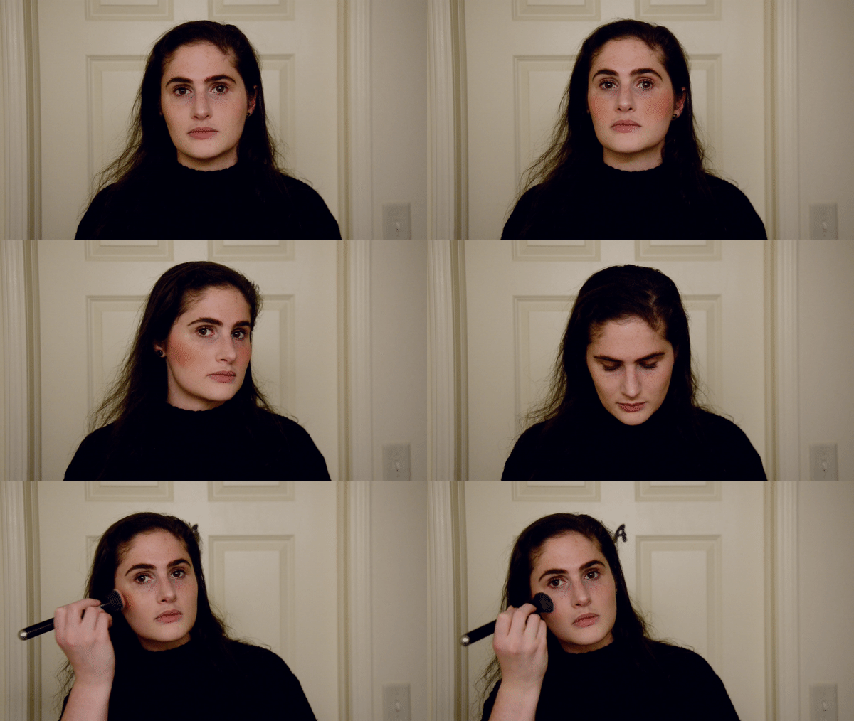
As the user is following along with the tutorial, the interface will highlight/preview the specific areas of the face they need to apply the next products to.
Share Finished Look
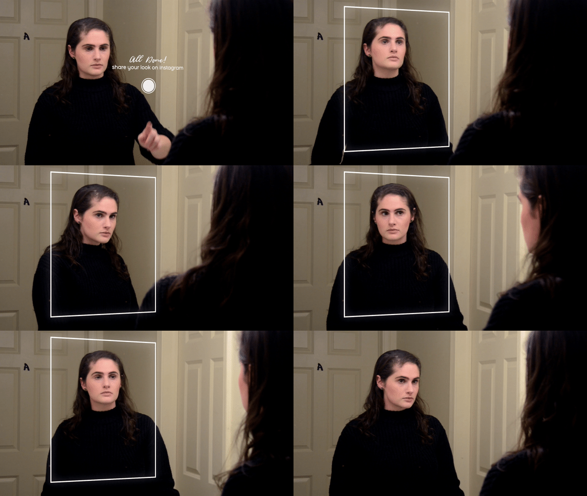
At the end of the application the interface will ask the user
if they would like to take a selfie and post to instagram,
or simply save the look in the system as a reminder of a favorite tutorial, for future reference.
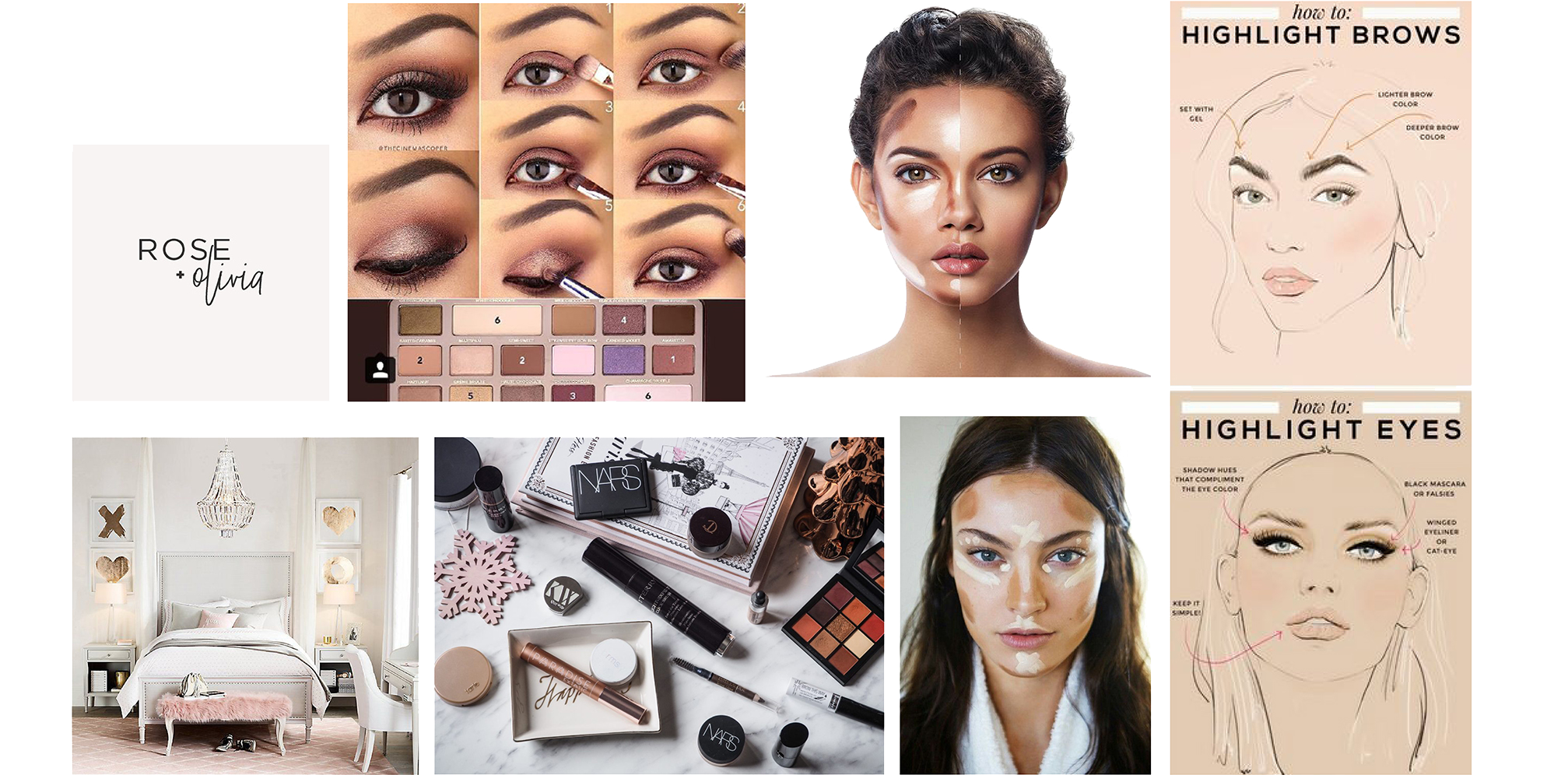
Mood Board
Knowing your audience in this scenario was key. Many women interested in this niche are Millenial women. Therefore I decided to make the interface have the classic "beauty guru" aesthetic: pink, marble, & inspirational quote typography.
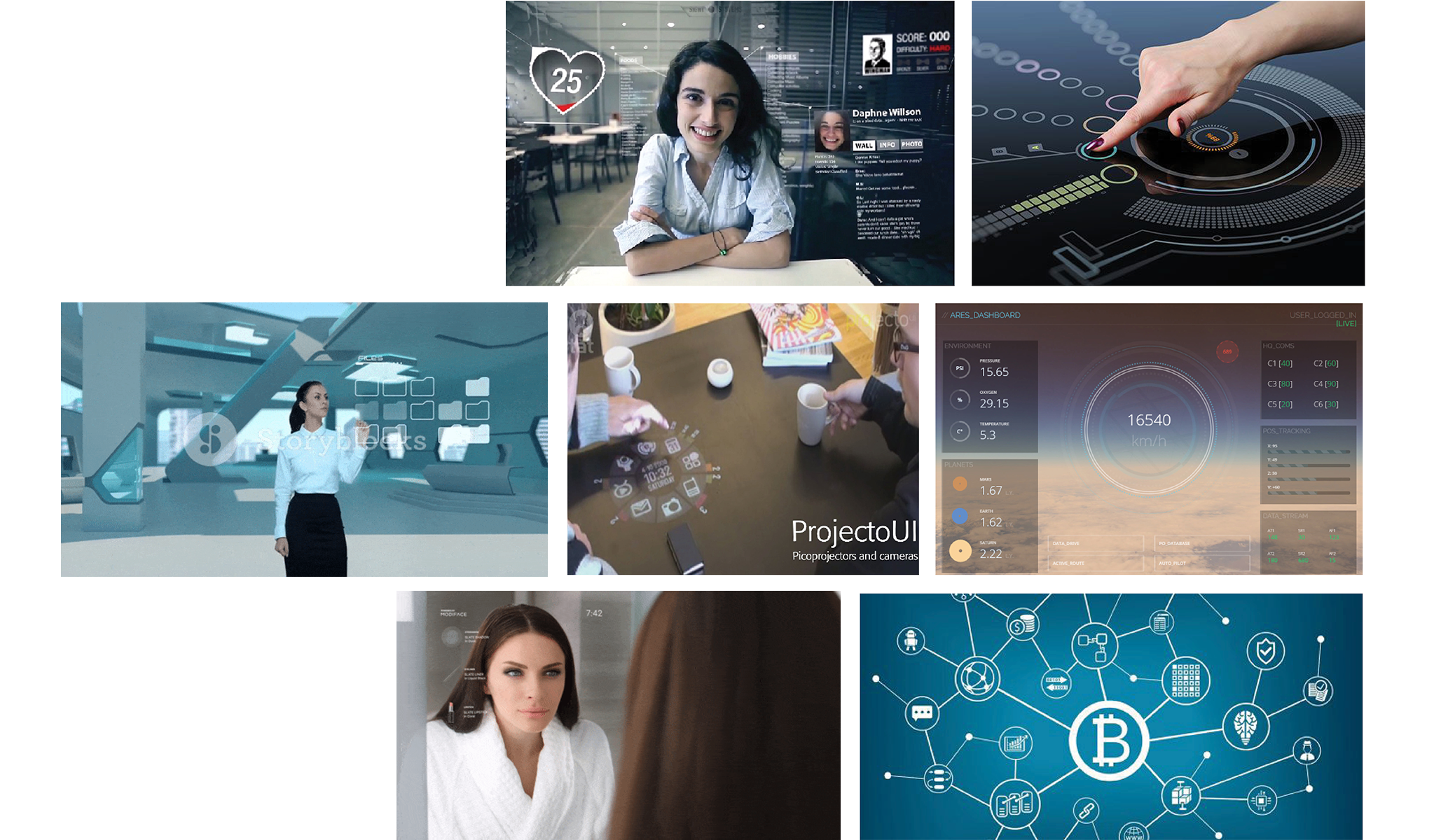
Inspiration Board
When it came to the feel of the interface, I wanted the buttons to be as clean and minimal as possible, putting more emphasis on the user's appearance and colors of the products used, rather than having the interface be too distracting.
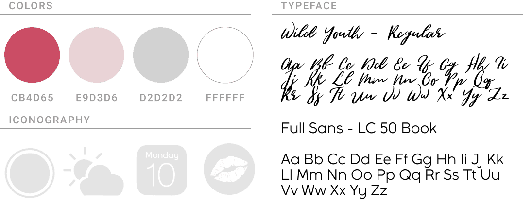
Style Guide
Clean, Minimal & Modern; Very millennial, blush pinks & white. Pulling a lot of inspiration from the “beauty vlogger” aesthetic. Due to the interface being on a mirror, much of it is low-opacity, so the user can still see themselves through the elements.
Final Thoughts
I learned a lot with this project, and have several ideas on how to push the concept & visuals further. Since the main focus of this project was on animation, timing, mapping animation into physical space & masking out hand gestures, I would love to be able to push the project into stronger UI visuals, for a more well-rounded piece.