Discipline Data Visualization, Graphic Design
Duration 3 weeks

Prompt
In every dataset there is a story. There are thousands of datasets on kaggle.com to work with that cover a broad range of topics, from this we were to use that data to create a compelling infographic. Once the data was analyzed we were to determine an angle, a story, to focus in on and let that guide the decisions made while developing the design.
Concept
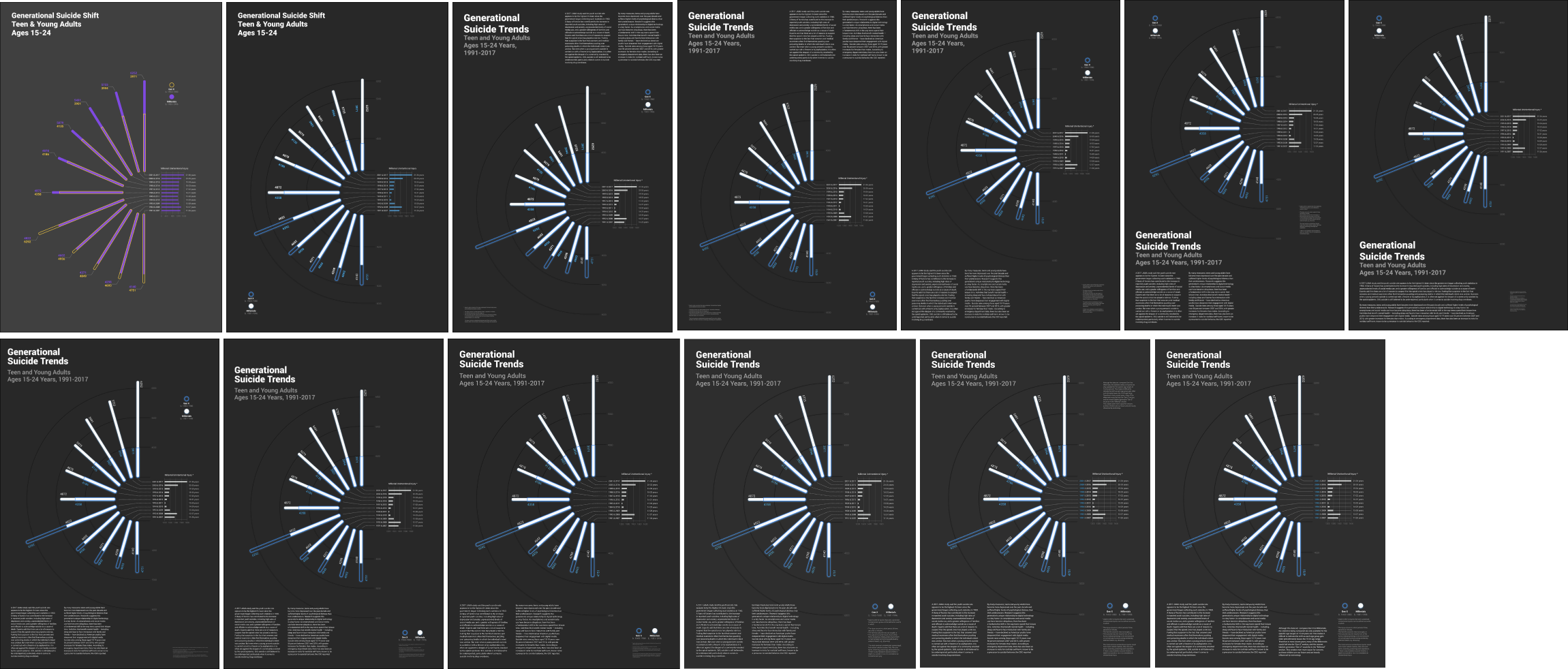
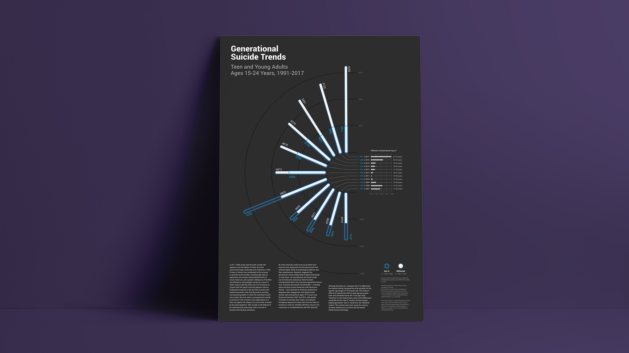
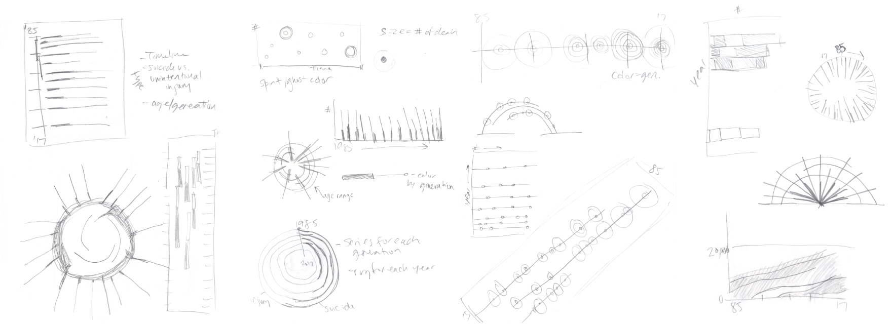
Working with the data set from Kaggle
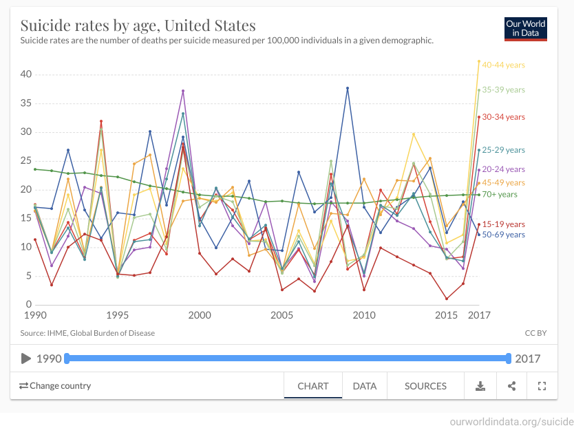
“Suicide Rates Overview 1985 to 2016”
There are many existing data sets and visualizations comparing many varying components regarding suicide statistics.
I wanted to take a different approach and see if
I could visualize any trends happening in suicide rates generationally, to see if there were any external factors impacting these individuals other than their age groups.
Concept Pursued
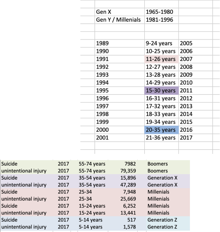
After doing some more research I found that the most staggering generational shift in numbers were the teens & young adults. I was curious if any modern technologies had anything to do with the increase in numbers.
I went through the data set from Kaggle and compared the data to the “Ten Leading Causes of Death and Injury” from the CDC (Centers for Disease Control & Prevention).
I was only able to compare 2 generations in the end, Gen X to Gen Y. Ideally I would also get numbers on Baby Boomers, and if possible also get the Unintentional Injury numbers for Gen X & Baby Boomers, to really see if there are other shifts happening.
Sketches
Color Exploration
Visually I wanted the colors to pop and have a glowing effect to make it look like floating souls. I ultimately went with an off white and bright blue, putting a glow effect on both shapes to make them look like stars in the sky.


Iterations