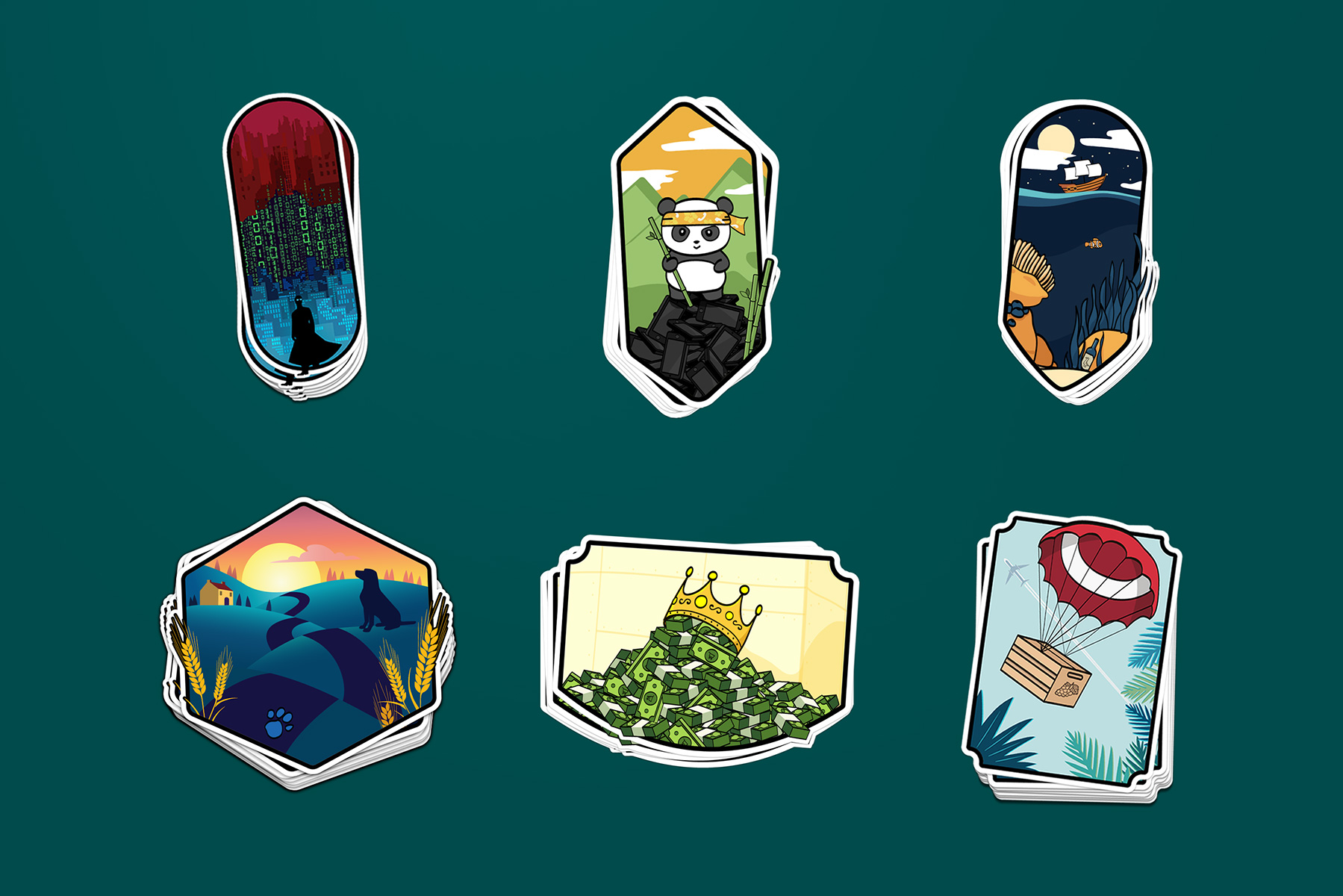
Agile Logos
Total Wine
Discipline Illustration, Branding
Duration 9 weeks


PROMPT
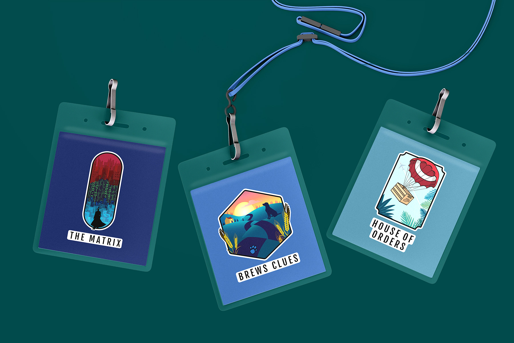
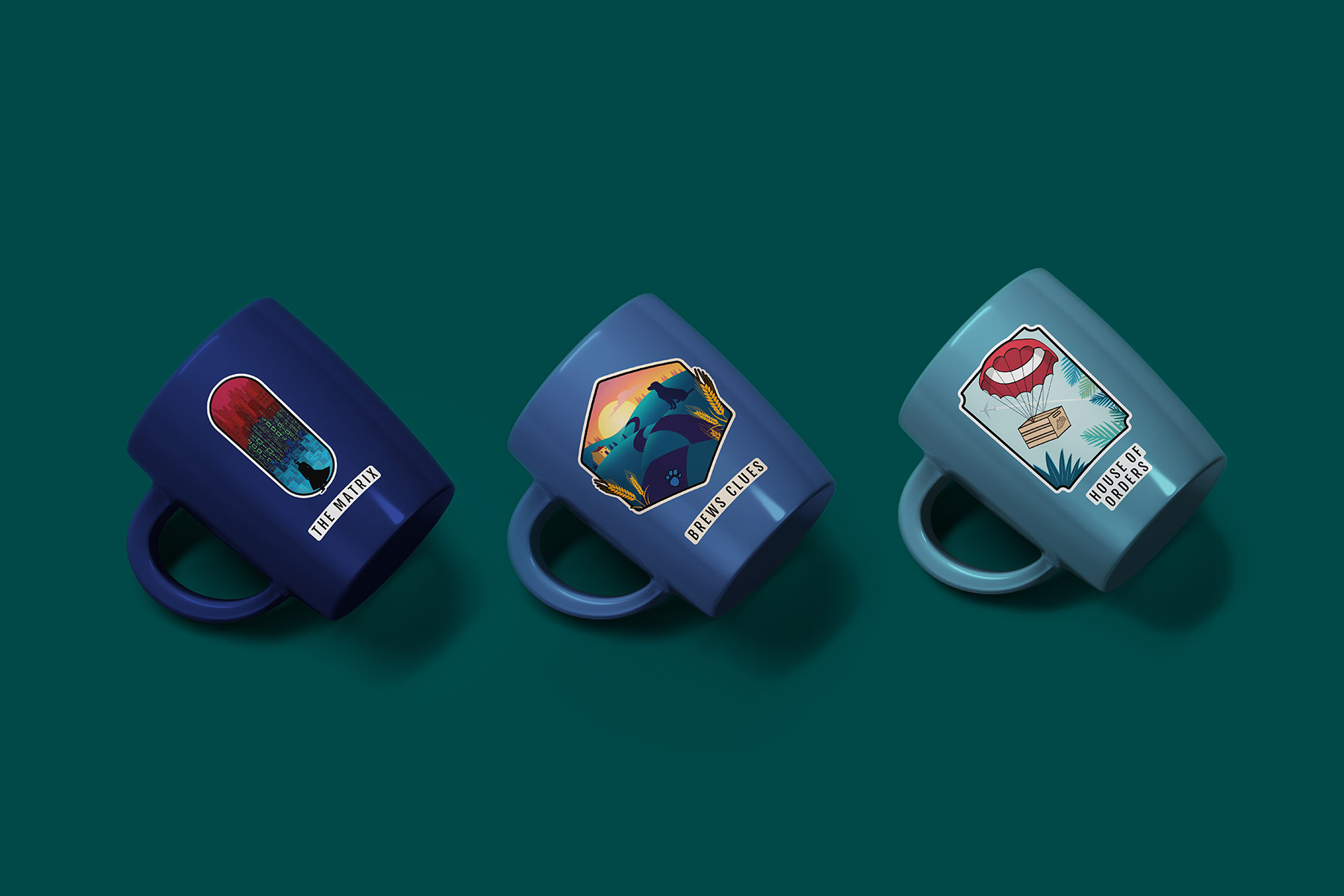
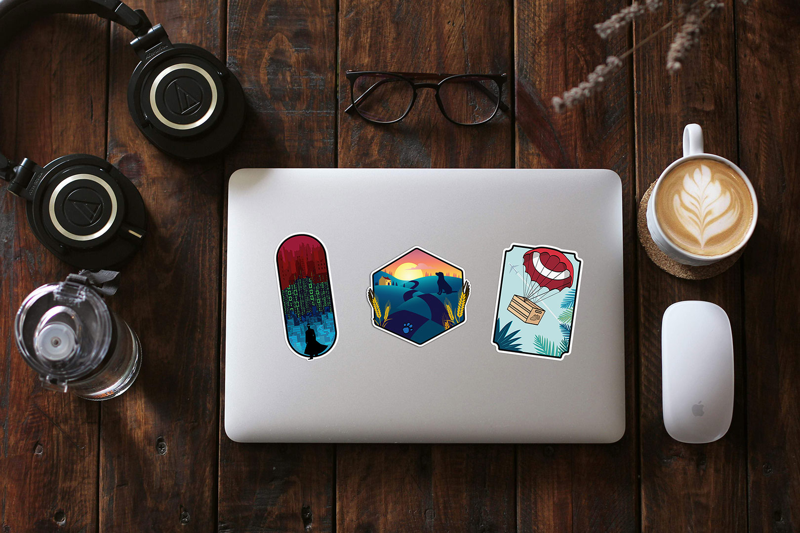
Summer of 2019 I had the opportunity to work as a UX Design intern for Total Wine & More. One of the projects I worked on along with another design intern, was a series of Agile Logos to be used internally at the company. The logos were to be used primarily to identify each agile team on the digital floor, as well as having a cohesive set of designed pitch decks for each team to present their work every 2 weeks.
Interviews
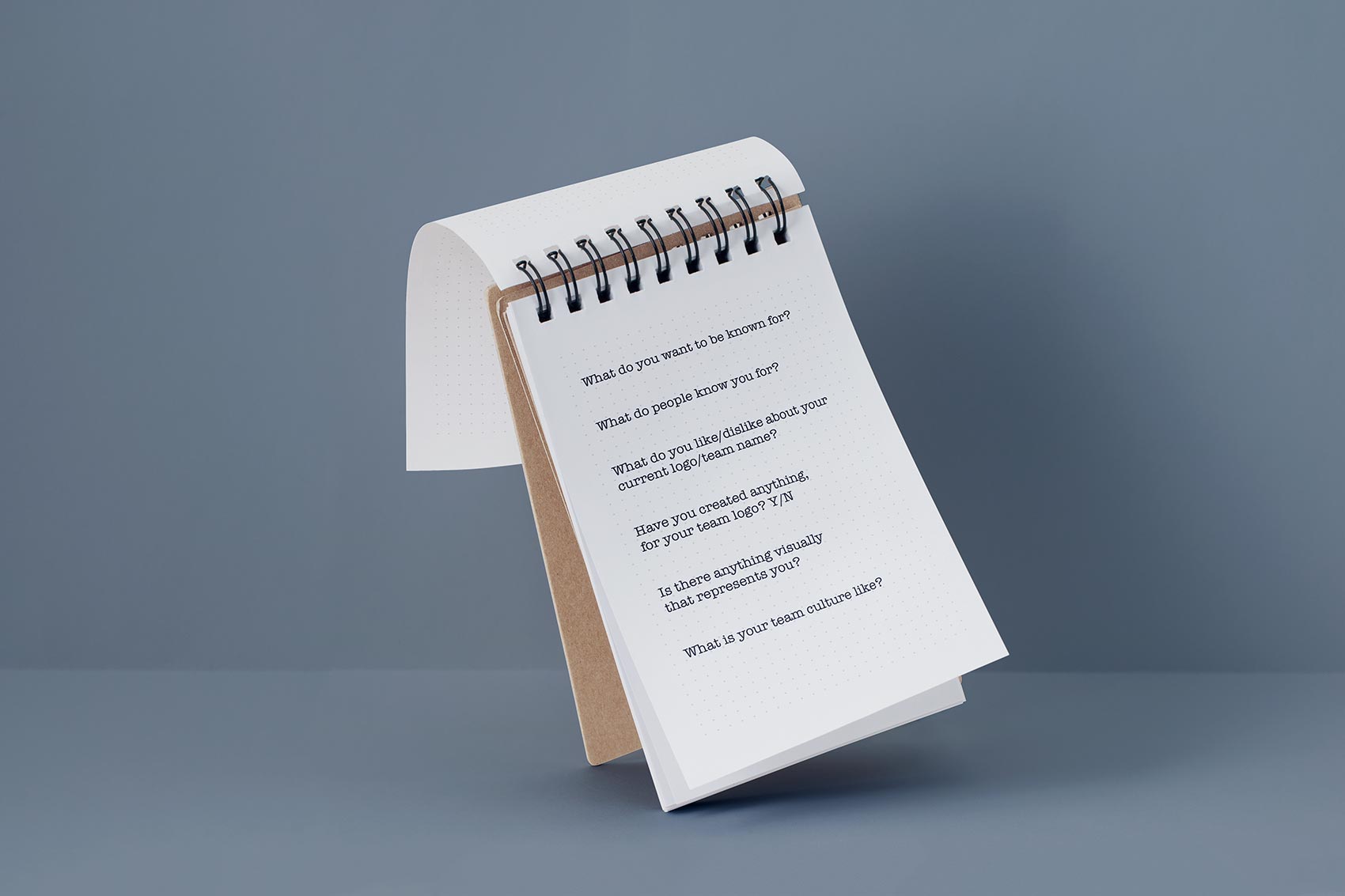
Before any design work could be done we scheduled meetings with each of the Agile Teams, to discuss team names, and any initial ideas they collectively had for their logos.
Collaboration
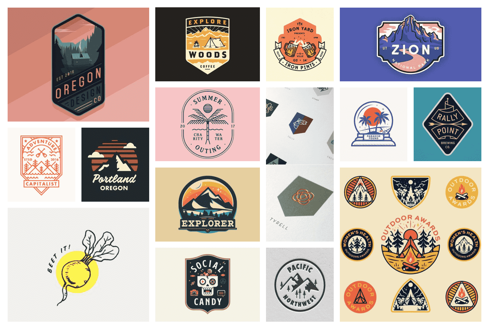
From here my collegue and I came up with an overarching concept for the series of logos. We landed on stylizing them as if they were camp badges, creating an individual illustration for each Agile team.
We also decided to split the workload at this point so we could balance our other projects. While still scheudling touch points with one another to be sure we could give each other feedback.
House of Orders
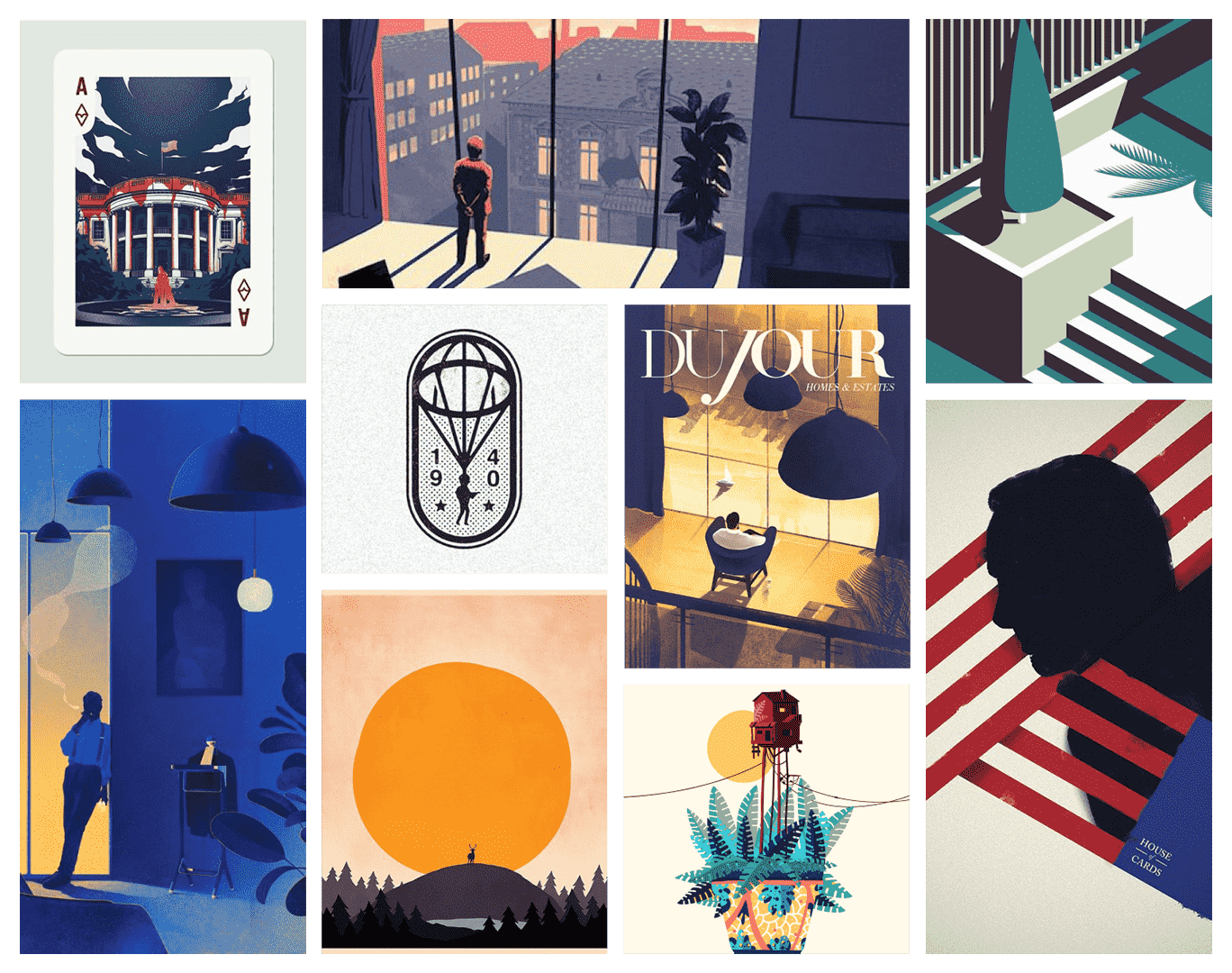
Inspiration Board
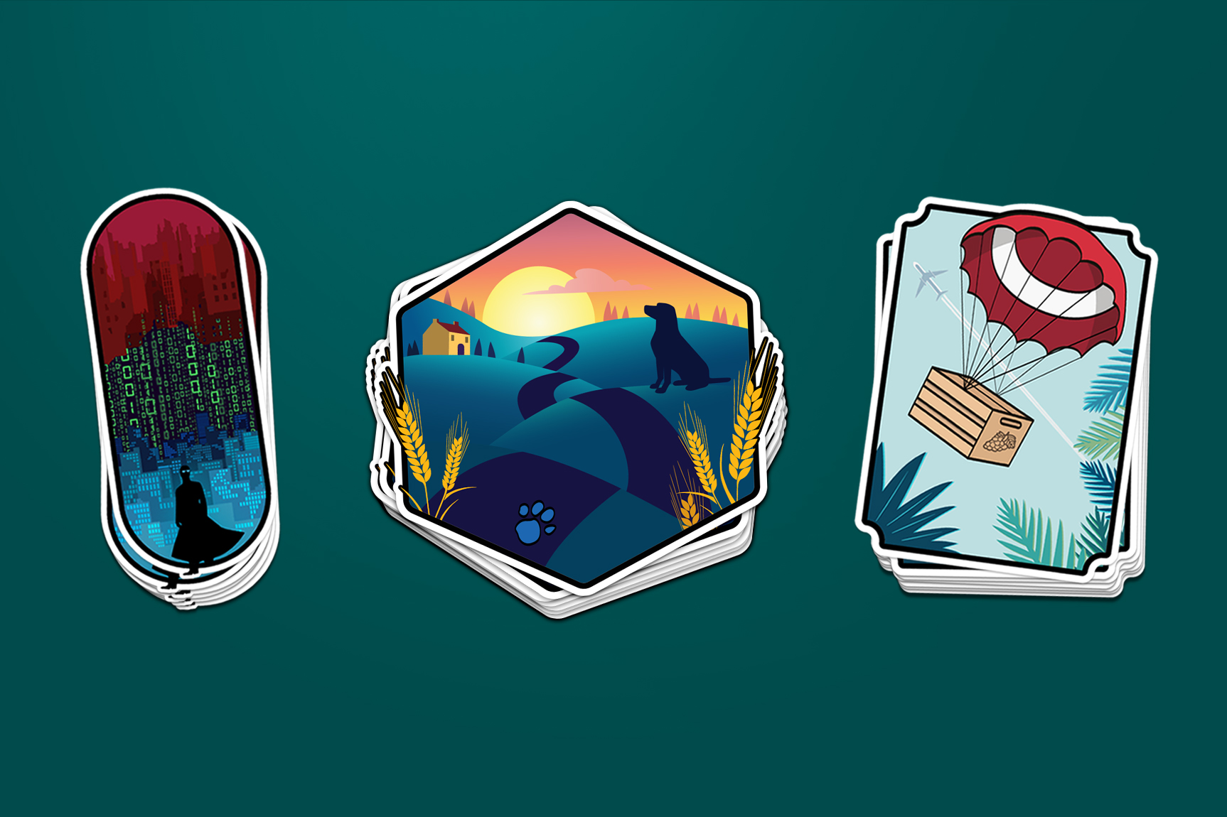
The House of Orders team is in charge of: Fulfillment, Customer Service, & Order Management System.
With the reference to House of Cards, they wanted to have a patriotic color scheme & illude to the fact that they work with delivery.
House of Orders
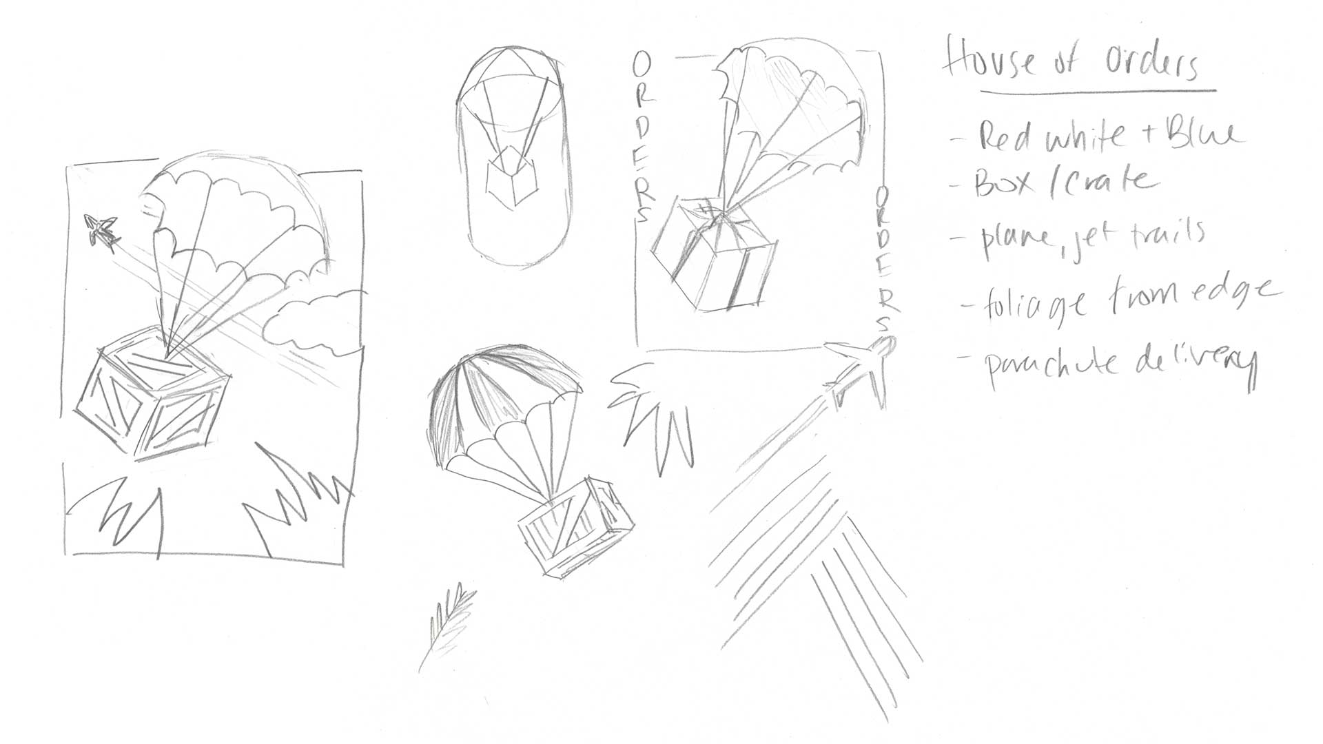
Sketches
The team mentioned they wanted to have some kind of visualization of delivery of wine. A delivery truck seemed too obvious, and with the theme of having natural elements fo each logo, we decided on air delivery.
House of Orders
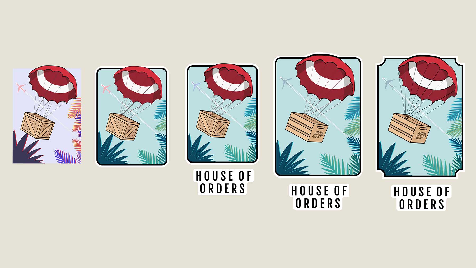
Iterations
The universal colors and treatment of the box changed as the design progressed. The ultimate framing of the logo was shapes to look like a playing card.
The Matrix
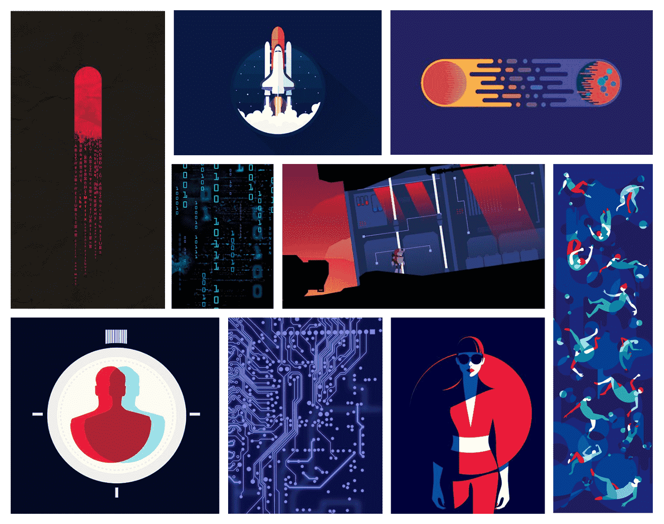
Inspiration Board
The Matrix team is in charge of: Customer Personalization, by analyzing their data. With the obvious reference to
The Matix, they requested to have the 101010 digitized numbers (referencing data).
The Matrix
Sketches
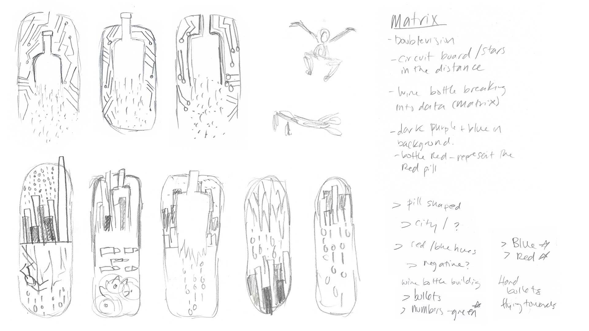
With the sketches we explored utilizing a circuit board,
a wine bootle, and the requested digitzed numbers.
In the second pass of the logo it shifted to working with the skyline, the human figure, and making the encloser a pill shape.
The Matrix
Iterations
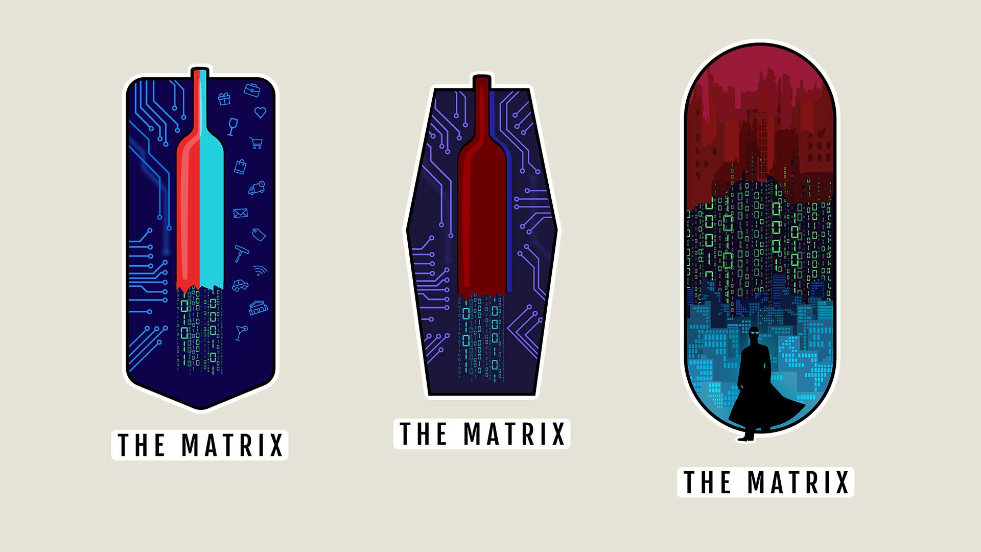
The initial approch to this logo was to have a wine bottle over a circuit board. However, the team wanted more imagry referencing the actual movie.
Brews Clues
Inspiration Board
The Brews Clues team is in charge of: Landing Pages.
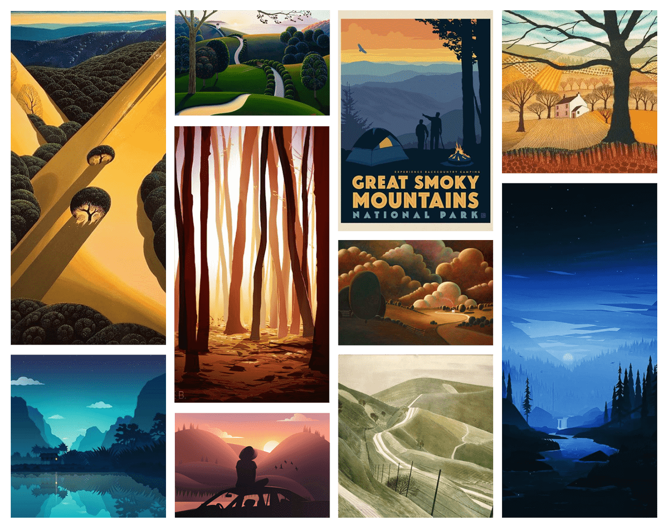
With the reference to Blues Clues, they wanted to show they were the path to the perfect drink, as they guide the user down the purchase path.
Brews Clues
Sketches
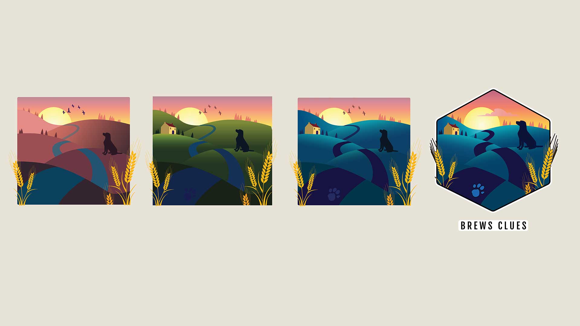
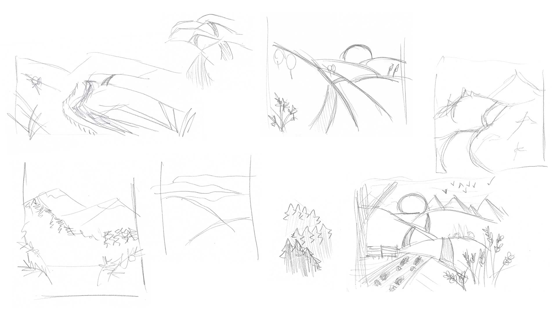
The team expressed that they wanted to make the the logo to reference exploration, so our approach was to include a landscape with different elements on each of the rolling hills.
Brews Clues
Iterations
For this logo visualization we wanted to have wheat (hopps) in the forground leading the viewers eye into the scene. The colors also went through a few different passes before landing on the right combination.
